All about Living Coral, Pantone’s Colour of the Year, with Abigail Bruce
)
When it comes to design, colour is so key – but why? Ahead of her appearance at Pure London AW19/20, I sat down with Abigail Bruce, Marketing Director at Pantone, to find out more about Pantone’s colour forecasting process and this year’s Pantone Colour of the Year, Living Coral.
Talk me through the process for selecting the Pantone Colour of the Year
The Colour of the Year selection process entails thoughtful consideration and trend analysis; and is a culmination of the macro-level colour trend forecasting that the Pantone Color Institute™ conducts year-round to inform this selection as well as other professional trend forecasting products.
To arrive at the selection each year, the global team of colour experts at the Pantone Color Institute comb the world looking for new colour influences. This can include the entertainment industry and films in production, travelling art collections and new artists, fashion, all areas of design, popular travel destinations, as well as new lifestyles, playstyles and socio-economic conditions. Influences may also stem from new technologies, materials, textures and effects that impact colour, relevant social media platforms and even upcoming sporting events that capture worldwide attention.
The colour we select to be our Pantone Colour of the Year is the one that we see building in importance; a colour that can communicate out the colour message that best reflects what is happening in our global culture at a specific moment in time; a colour we see crossing all areas of design that serves as an expression of a mood and an attitude; a colour that will reflect what people are looking for, what they feel they need that colour can help to answer.
Do you have a favourite Colour of the Year?
As a lover of all colour, it’s nearly impossible for me to choose a favorite! When it comes to Colour of the Year, I can’t say I loved one more than any other – each of the them is intended to express the current feelings, moods, attitudes for that given time. The selection serves as a strategic direction for design and colour-conscious industries, and to start a conversation about colour that more and more designers, consumers and brands are joining.
Tell me a bit more about Living Coral, 2019’s Colour of the Year
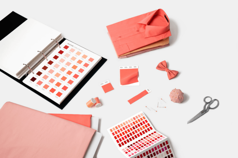
PANTONE 16-1546 Living Coral is an animating and life-affirming shade of orange with a golden undertone. We get energy from nature. Just as coral reefs are a source of sustenance and shelter to sea life, vibrant yet mellow PANTONE 16-1546 Living Coral embraces us with warmth and nourishment to provide comfort and buoyancy in our continually shifting environment.
In reaction to the onslaught of digital technology and social media increasingly embedding into daily life, we are seeking authentic and immersive experiences that enable connection and intimacy. Sociable and spirited, the engaging nature of PANTONE 16-1546 Living Coral welcomes and encourages lighthearted activity. Symbolizing our innate need for optimism and joyful pursuits, Living Coral embodies our desire for playful expression.
Representing the fusion of modern life, Pantone Living Coral is a nurturing colour that appears in our natural surroundings and at the same time, displays a lively presence within social media. PANTONE 16-1546 Living Coral emits the desired, familiar and energizing aspects of colour found in nature. In its glorious, yet unfortunately more elusive, display beneath the sea, this vivifying and effervescent colour mesmerizes the eye and mind. Lying at the center of our naturally vivid and chromatic ecosystem, Living Coral is evocative of how coral reefs provide shelter to a diverse kaleidoscope of colour.
 What are the upcoming colour trends you’re most excited about?
In addition to PANTONE 16-1546 Living Coral as the 2019 Colour of the Year, we’ve curated five different colour palettes that help bring this year’s special shade into your designs and illustrate the dynamic nature of the colour within various combinations. These palettes demonstrate other colours that pair well with Living Coral, depending on the tone of your design.
For example, combined with an understated, composed and cool colour grouping such as PANTONE 15-4003 Storm Gray, PANTONE 19-5230 Forest Biome and other similar tones, Living Coral becomes a focal point that immediately draws attention.
Alternatively, PANTONE 16-1546 Living Coral works well with naturally vivid colours such as PANTONE 13-4810 Limpet Shell and PANTONE 15-1912 Sea Pink or PANTONE 13-0858 Vibrant Yellow, displaying a diverse kaleidoscope of colour.
What will you be speaking about at Pure London this season?
Naturally, my speech at Pure London will be focused on colour. I will be talking about colour trends taken from our PantoneVIEW Colour Planner Spring/Summer 2020 - highlighting our forecast, with inspiration and key colour families for application across men’s women’s, active, colour cosmetics, interiors, industrial as well as multi-media design. I’ll also include some insights from VIEWPOINT COLOUR 05 magazine, where we take a lifestyle approach to colour. I’ll highlight latest colour stories and their application in design. And, of course, I’ll share insights about our PANTONE 2019 Colour of the Year, and some of the palette combinations we recommend for designers.
Is there anything you’re particularly looking forward to at Pure London?
I’m just thrilled to be invited, and to learn and share from the many creative minds that Pure London brings together. I think it’s an outstanding event for British and International Fashion, to showcase leading and emerging trends. I’m always attracted to the colour-minded so the geek in me will be curious to see how designers are using colour in new and different ways to communicate or express their vision.
Join us at Pure London AW19/20 to hear more from Abigail and make the most of her colour expertise for your next season plans.
Register today for your free ticket.
Abigail will be speaking at 14:00 on Monday 11th February on the Pure London AW19/20 Main Stage. Find out more here.
